Between the guidelines
Obama Foundation
07 July, 2025
Hamish Smyth
Co-Founder
For this edition of Between the Guidelines, we spoke with Tom Crabtree and Vanessa Lam of Manual, the creative studio behind the Obama Foundation’s newly refreshed identity and expansive brand guidelines built on Standards.
From custom type to a deeply considered design system, this is the story of how a presidential legacy brand will live into the future.
“We were designing a system of systems — flexible, but still cohesive.”
The Obama Foundation is a nonprofit organization established to inspire, empower, and connect people to change their world. Founded by President Barack Obama and former First Lady Michelle Obama after leaving the White House, the Foundation aims to carry forward their values of civic engagement, leadership development, and community building.
At the heart of the Foundation’s work is the belief that meaningful change comes from the ground up. It supports emerging leaders around the globe—particularly those working in underserved communities—by equipping them with the tools, training, and networks needed to drive progress across numerous programs.
Interview with Tom Crabtree and Vanessa Lam, Manual
HS
Tell us about Manual. How did the studio begin?
TC
Manual is a design and branding studio based in San Francisco and Amsterdam. Founded in 2009, we’ve grown into a team of about 10 to 15 people. We shape and amplify world-changing ideas with a focus on brand identity and expression, working with organizations that have a meaningful impact on society.
VL
I joined Manual about two and a half years ago. Before that, I worked at Character, Wolff Olins, and in-house at MoMA. What drew me to Manual was the scale and the intentionality. Every project here feels personal and thoughtfully made.
HS
How did the Obama Foundation project come about?
TC
The Obama Foundation approached us to design an identity for the Obama Presidential Center in Chicago. As we delved deeper, it became evident that there was a broader need: the Foundation’s existing brand hadn’t evolved since its inception, and there was an opportunity to bring greater cohesion to everything they were doing — from programs and campaigns to digital experiences.
HS
Did you retain anything from the original identity?
VL
The Obama rising sun logo, which is incredibly iconic, remained. But everything around it needed to evolve. We looked at how the identity could stretch across formats, audiences, and contexts. The Foundation does so many different things—youth leadership, civic innovation, global programming—and we needed a system that could contain that breadth while still feeling cohesive.
“We were designing a system of systems — flexible, but still cohesive.”
HS
What was your approach to the guidelines themselves?
VL
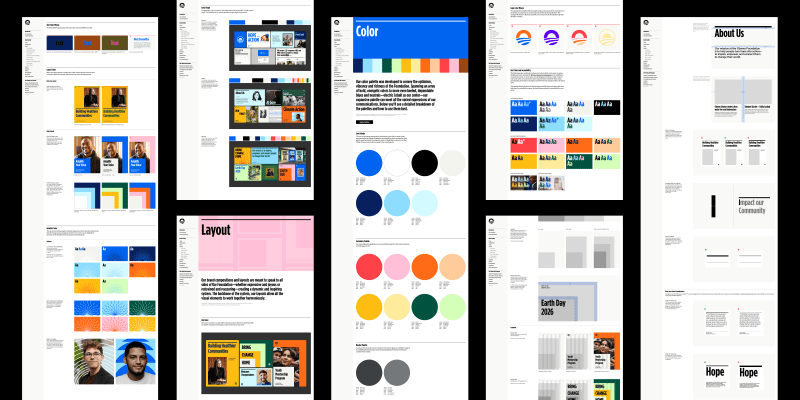
We started with the brand strategy, which gave us a strong foundation. Then we built out a modular system: color palettes, custom type, motion behaviors, iconography, and guidance for layout and content. The system had to be expressive, but also intuitive. It needed to serve people inside the organization just as much as it served external partners.
HS
Were there any structural challenges?
TC
Absolutely. The Foundation is a nonprofit, but it’s also a public-facing global brand. It speaks to many audiences — students, donors, organizers, international leaders. So we had to consider tone, accessibility, and adaptability at every step. Programs like the Obama Scholars or My Brother’s Keeper each had their own visual quirks or legacy assets. We designed a brand architecture that let them maintain their individuality but still feel “of a piece” with the Foundation.
“The custom typefaces helped create a tone that felt both institutional and optimistic.”
HS
What kinds of constraints did you run into?
VL
Accessibility was a big one — which is a good thing. When you’re designing a system at this scale, it has to hold up on mobile, in presentations, on social, in print, on signage — and do so accessibly. The Foundation’s digital agency, Work & Co, gave us valuable feedback, especially around contrast ratios and web-safe color usage. It pushed us to test our assumptions and refine the system.
HS
How did the Foundation’s team respond?
TC
They were incredible. Their internal design team was engaged from day one. They took time to really understand the system — they weren’t just skimming it, they were studying it. That kind of investment is rare, and it meant we could go deeper in the guidance because we knew they cared.
“They weren’t just skimming — they were studying it. That kind of engagement is rare.”
HS
Why did you decide to build the guidelines on Standards?
TC
We’ve done guidelines every way imaginable. Static PDFs, shared folders, proprietary CMS tools. Standards was a breath of fresh air. It gave us the ability to structure content logically and tell a story. That storytelling aspect—the idea that you could guide someone through the why and the how—was huge for this project.
VL
The ability to link between sections turned the guidelines into a real navigation experience. Asset download buttons were essential too. And multiplayer editing made collaboration way smoother, especially since we were working across teams and time zones. Also, the overall polish of the platform was important. When you’re presenting something to a client like the Obama Foundation, the platform has to reflect the care you’ve put into the work. Standards does that. It elevates the whole thing.

HS
What’s next for the Foundation’s brand system?
TC
We’re exploring new modules — particularly signage and wayfinding, which are key to the Obama Presidential Center experience. But the broader idea is that the system isn’t static. It’s something the Foundation can evolve as new programs launch or new needs emerge.
VL
More real-world use cases, for sure. We want to show how the brand looks in action across events, campaigns, social media, internal comms. That helps the team not just follow the rules, but feel the brand in context. It’s the difference between reading sheet music and hearing the song.
“It’s the difference between reading sheet music and hearing the song.”
HS
What else is Manual working on right now?
TC
We’re deep into another big guidelines project, also using Standards. It’s a very different client, but the same principles apply: clarity, expression, flexibility. We can’t say much yet, but we’re excited.
Thanks to Tom and Vanessa for sharing their work, and for building one of the most thoughtful systems we’ve seen on the platform to date.
Extras
Learn about the Obama Foundation at obama.org
See More of Manual’s extensive portfolio at manualcreative.com