Release notes
Mobile breakpoints, custom grids, new menus, and more.
11 August, 2025
Skylar Aieta
Product Designer
We’re thrilled to announce that Standards 12.0 has been released, and includes some of the most substantial new features and enhancements since our beginning. This update now allows for full optimization across multiple breakpoints and introduces new ways to design menus and layouts. We have a lot to cover, so let’s dive in.
Responsive editing
Breakpoint modes
The editing experience has been redesigned to include three breakpoints: Desktop, Tablet, and Mobile. Each breakpoint may use its own unique settings allowing you to fully optimize your project for different screen sizes.
Note: Tablet & Mobile breakpoints are optional. All projects use the Desktop breakpoint by default, and the design of existing projects will not be changed. Additional breakpoints may be added at your discretion.
For more information regarding breakpoint modes, see our guide.
Custom grids
Grid settings have been overhauled to include a pivotal new feature: custom grids. Previously, each project was restricted to a 12 column grid for every layout at all screen widths. Now each breakpoint may use its own default grid, allowing you to quickly optimize the high level structure for any breakpoint.
For more information regarding grid settings, see our guide.
Content visibility
Although most settings are distinct to each breakpoint, the page contents remain identical across all breakpoints. With that said, we’ve added new functionality to content visibility, enabling you to select which layers are shown or hidden between each breakpoint. This allows you to easily control your design across different window sizes and decide what content is accessible.
For more information regarding content visibility, see our guide.

Setting overrides
With this update, we aim to prioritize your design decisions, avoid automating settings that alter previous work, and instead simply make it easy for you to make deliberate overrides to optimize your projects. For the most seamless experience, we’ve added subtle indications to illustrate when a setting has been changed from the default, along with the ability to reset them.
For more information regarding setting overrides, see our guide.
Dynamic new layouts
Rows redesigned
Rows have blossomed into a dynamic containing element called Layouts. Adding to the existing row features, layouts now have a flexible grid which can be set to any column count. Additionally, layouts can wrap when the columns go beyond the column grid count. This is fundamental to responsive optimization where the mobile breakpoint is most often a single column width of stacked content.
For more information regarding layouts, see our guide.
Sublayouts
We’ve also added an all new element type: Sublayout. Essentially identical to other Layouts (previously Rows), Sublayouts are designed to be added within existing Layouts, Columns, Dropdowns, Menus, etc as a powerful new design tool allowing all new forms of customization and control in your projects.
For more information regarding Sublayouts, see our guide.

Better menus and navigation
New menus
We’ve overhauled Menus and simplified them to be more flexible. Previously, Menus were categorized as either a Sidebar or Flyout. This distinction has been removed, but is now easily replicated with a few simple settings. This generalized approach to Menus provides a much broader array of possible menu designs. Additionally, all menu settings can be customized across each breakpoint, allowing for tailored navigation at any screen size.
For more information regarding menus, see our guide.
Adding new menus
We’ve also enhanced the menu creation process in both setup and the editor. When adding a menu, you can now choose from an extensive library of pre-designed styles, including new options like takeover and topbar alongside familiar styles like flyout and sidebar. For multi-page projects, new menus automatically populate with links to each page.
For more information regarding adding menus, see our guide.
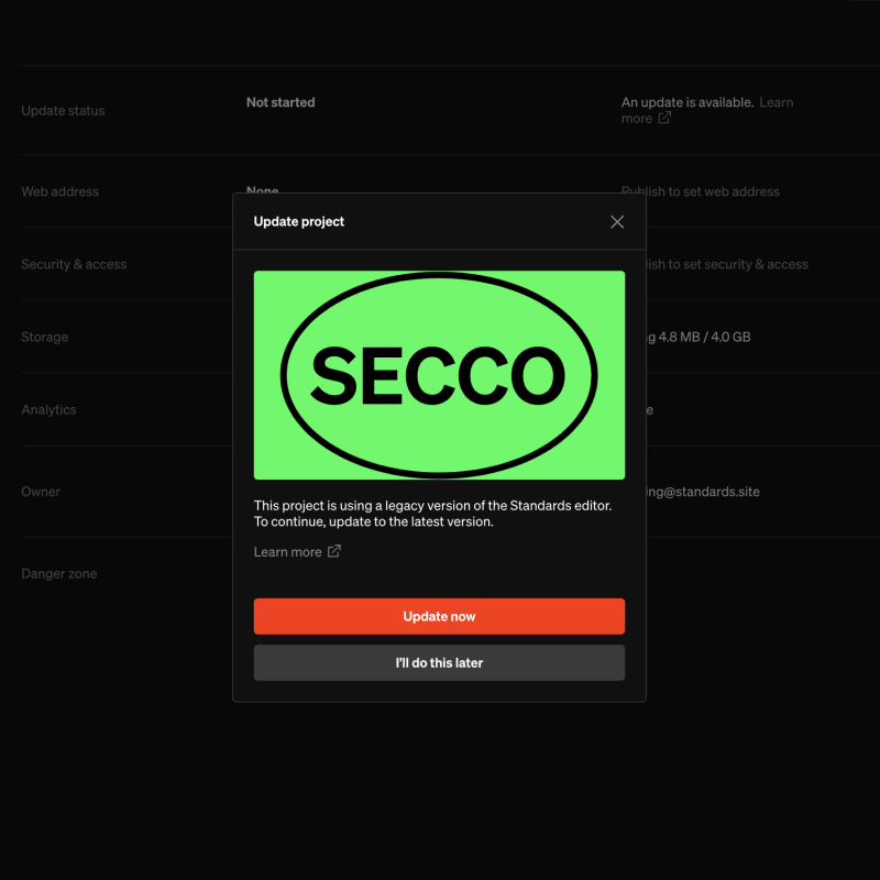
Updating your projects
This update required some substantial changes to our design paradigms and the backend of our app. As a result, we’ve also developed a migration process that will automatically update any projects created before release 12.0 to the latest version. This migration is required before editing existing projects, but will not cause any visible changes to the design or content of your project.
For more information regarding project migration, see our guide.
Get in touch
If you have questions or concerns about this update, have concerns don’t hesitate to reach out.